Monday, November 27, 2017

Contacting Designers, Little Message Contact Books Part 1

This year is an important year for contacting people. I wanted to be able to contact people in a way which will stand out and resemble me a a person. My idea is inspired by Michael Lester's Worlds Smallest Portfolio. It was his portfolio made into a tiny book with small images and one sentence for each and it was hugely success because it was so different.


I want to represent my love of publications by sending a letter in a small books, but not the worlds smallest book! This will catch the attention of designers and be something they can keep on their desk to keep me in their mind.

My first go at creating a small message was for Alecs task which gave us a week to contact someone. I wanted to contact Australian book cover designer Allison Colpoys asking if she could give me to feedback on some of my cover designs. I could not find her address so send it to the Jacky Winter Group who represent her as they are also based in Melbourne were she is from.


I felt it was a good and interesting way to share a message but felt it lacked look wise therefore for the next book I changed the size up slightly and used the same stamps I used for self branding inside.

The second book I created was for designer at 72&Sunny Wendy Depart. She is based in Amsterdam and I asked her if me and the PUB collective could come and interview her for our first issue of our zine in February. She said that would be okay so I wanted to send her a little message in a book to say thank you. I felt the style of the stamps made the book feel more personal as it relates to my branding. I like to start my books by Saying hello and including a picture of the designer and myself as this makes the book noticeably more personal this is something I want to continue. I also created a Belly band to hold the book together which is decorated with my fingerprints which also links to myself, I want to continue this so the contact books look more like a collection.


My Self Branding


Now I am in my Final year and am promoting myself more as a designer I need to figure out how to brand myself. This is something I have always struggled with but now I feel like I really know what I am interested in and what about myself I need to promote. 
 As a designer I am very personal. I always try and add handmade elements into any work and use interesting methods that I can scan and edit digitally. I also put my most care and effort into the projects by knowing as much as I can about the project and believing in the message I am communicating. I want to show this by creating a handmade logo. I have never been able to choose a colour that describes me perfectly. However after working on a project I found two colours that represents me together. 

After a talk with my tutor I found that when people ask what type of a designer I am I will say Identity, mainly within book covers, publication design and campaigns.


In one of my previous projects I created an art piece on identity within disability using finger prints. I loved this small project and wanted to use the finger print to resemble my own identity in self branding. I also wanted to show my hands on creativity by using stamps to create my name/type.

I used the colours red and blue as it was used within that project but also because the colours 
contrast. I love to travel and in the future see myself working around the world, however my
 self branding resembles the British flag with its colours which shows my pride for where I am 
from, but only subtly.


Friday, November 3, 2017

Glug, Things I wish I knew at 18


Last year I went to the Glug event and really enjoyed the atmosphere and listening to designers talk useful. So this year I knew I wanted to go again especially when I heard it was on the topic of 'Things I wish I knew at 18' I thought it would be interesting to here some advice from older designers to younger designers starting off. I made some notes on all the talks of what was interesting and useful to me.


Lisa Maltby


  • Its okay to be different 
  • She is on Kickstarter, with a children's book
  • Being Cheeky will get you everywhere 
  • Absolutely everyone is Winging it!
  • Feel the fear and do it anyway.
I now follow Lisa's Instagram and have been keeping an eye on her Kickstarter projects.

Kyle Wilkinson

  • Embrace all the briefs and projects that you do
  • Just because its successful doesnt mean its right for you.
  • Time is your enemy.
This man gave good advice and it was fun to hear about his journey


Ashton Wesley

  • Embrace the challenge 

  • What uni is actually for....
> Leave your comfort zone
>Fill your tool box and create stuff
>Build a support system


Lou Mycroft

  • Brene Brown
  • Work is a lot more than about money
  • Change the world
  • Look for the positives
It was interesting to here from someone older as she talked about what design used to be like and how much different it is


Russ Poulter

  • Web designer 
  • Flo design
  • Push for it to be better
A funny man with a funny presentation


Eleanor Snare

  • Relationships are everything, (you are never alone)
  • Boring stuff is surprisingly important
  • Dont ignore the causes of mental health problems
  • Lighten up, find joy in moments
  • You are worthy of love and belonging


Overall I love going to Glug events because I get to learn about people I have never seen or heard off the themes are always helpful and fun and the atmosphere makes it very approachable to talk to all the creatives who talk and are in the audience!

Sunday, May 7, 2017

Module Evaluation

Overall OUGD502 has been an important module for my development this year. I attended many design related talks, events and exhibition which all inspired and helped me with my design in some way. I was able to interview two creatives about there designs and was able to gain knowledge about them and form a connection, which can be important for my work next year. I was also able to work on some client work in my spare time for a school. I found this a good experience as I had to follow some strict instructions and have a more strict time scale. I also had to work in a professional way. I really enjoyed this module because I am able to focus on what design I enjoy the most and learn more about it through experience and research. I am now beginning to find out what I am the most interested in which is book design. I also feel like this module is helping me gain confidence as I am going out of the college environment to meet and talk to new people. I am also getting better and better at public speaking and sharing my thoughts and opinions on design due to practice.

Friday, May 5, 2017

Interview on Issuu

A Reply from Coralie

After messaging Coralie about my book I got a reply on the same day!


She seemed really impressed by my booklet and was happy to give me an address. This was great as that is what I wanted to achieve by creating something for her so that I would be able to keep in contact with her. When I send the book I want to hand write her a letter talking a bit about myself and asking if she knows of any book related placements I could do. I hope that she was impressed by my efforts and that she will be able to help me. I found the interview helpful as I was able to ask a very successful designer advice and learn about her as a person.

Thursday, May 4, 2017

Binding my book

After creating my covers and printing and cutting my pages I decided to perfect bind my book. This is a more traditional binding method and I felt this would work best with my book even though it is small. I found the binding okay to do however when I went to put my cover on I realised I had made a mistake as I had not placed my design on the screen well which meant the pattern would not sit centrally on the cover. I decided to go ahead with putting the cover on anyway as I really liked how they printed and felt that Coralie would appreciate a more handmade feel as it would look more professional and one of a kind. Once I finished creating the books I took a photograph and emailed Coralie. She had liked my design Instagram posts of me making the book and I wanted to ask her if I could send her a copy.


Wednesday, May 3, 2017

Barter Books

One day in easter when I was home from Leeds I decided to visit Barter Books in Alnwick. Barter Books is a old train station converted into a second hand book shop. The Shop has its own cosy and friendly identity. There are fireplaces to sit and read by and dogs are allowed in. I love this shop due to its originality and traditional feel. There is hand painted type all around the place used to write quotes and sections of books. I love the traditional but homely feel this gives. I also like to look at the old book covers and collections some of which are worth hundreds of pounds and are kept behind glass. I find Barter Books is a place I can go to be inspired by book design and helps me see that there is a future to printed books and that books are loved know matter how old.


Highs and Lows of Level 5

Reflecting back on level 5 I feel that my work has defiantly improved. I am getting more confident in my design decisions and my way of working. My most proud moment of the year was going to see Coralie Bickford Smith talk at her exhibition. It was amazing being able to meet her in person and I felt more confident and inspired after it. My favourite project I worked on was UK greeting cards mainly because there was such a large change from my initial ideas and designs to my final designs. This was due to all the feedback I was receiving. I good new thing we have started this year is a small group started critical Wednesdays (Pizza Crit Night) anyone could join us and we stay in till 9 and order takeaway to the studio. This encouraged us to stay in and do work as well as spend at least one night a week getting feedback on our work. One weakness of this year has been playing it safe. I feel like I could have used more traditional techniques rather than just thinking that digital was the best option. I also am not the best at essay writing therefore next year I will need to work hard at COP if I want to reach my grade target. I found this year that I really enjoy designing for exhibition purposes as the work does not need to be as practical. This was shown within OUGD505 when I sewed a A3 poster. This took hours but was something I wanted to do as it was relevant to the subject and I wanted my work to stand out. I have changed a lot since my first year and since I started designing as I am getting more and more ideas and am becoming more knowledgable in techniques. My personality has also changed as I am becoming more and more confident. Overall I have had many opportunities this year to be creative and explore what design interests me and what I do not enjoy as much. I am definitely growing as a designer by gaining knowledge and I am really excited to continue growing within level 6.


Love Triangle Level 5 Exhibition

When we were briefed on Life's a pitch we were also told that we would be putting on an exhibition for the three courses (Graphics, Illustration and Animation). They were looking for volunteers from each course. I have never been in charge of an exhibition before other than helping last year put up the bank notes. I decided since I had been good with my time management that I would put myself forward to help the exhibition as I had the time. I also find myself an organised person and enjoy taking part in events therefore I was happy to take part.

In the meetings I found the role of making sure that the graphics students are informed of dates and taking down information for my course. I felt this was a good role for me as I am organised. I Also voted on some of the branding designs and the name Love Triangle. It was interesting to be able to see the point of view of the illustrators and animators. I also put forward other ideas for displaying the work.

I will be collecting work for the exhibition on the 10th and then I will help to set up the exhibition and get ready for the launch night on the 15th. I will also be helping to purchase added extras for the launch night.

It has been a good experience working to a budget and with people who I don't normally work with. Although times have been stressful I'm sure that the exhibition will go well and Im glad I was apart of it.


Final Cover designs

After looking at my design and different colours I decided to get some feedback on weather screen printing was the best idea for my covers. Everyone agreed that it is relevant to the designer but also personal which is nice. They felt screen printing would make the book stand out more to coralie as the aim of the book is to keep in contact with her and to make my work memorable to her.

I created the back cover using the same pattern as the front. I replaced the title with a blurb. I wanted the blurb to resemble that of a children's story therefore I wrote it as if me and Coralie were characters in a book. I then screen printed the designs onto blue paper in two shades. Even though the covers have small text I still got some good and clear prints. I will be creating 3 books one for me, one to send to Coralie and one spare.


Tuesday, May 2, 2017

Shy Bairns Exhibition/Launch

After my work was chosen to go into the shy bairns zine I decided to travel to Manchester to go to the exhibition celebrating the launch of the second zine. I loved being able to see my work published in 250 zines. I was also able to talk to others who were in the zine and other creatives who are students in Manchester. I really enjoyed being able to submit photography which I enjoy and be able to see printed by Risograph. Overall it was a good experience and it has left me feeling more determined to enter my work into more competitions.


Briar Mark - Hand Stitched Type

When creating my material poster for the 505 brief I came across work from a women called Briar Mark. I found her hand stitched type amazing and the time and effort she puts into her type is inspiring. The Auckland/New Zealand based designer makes fun of the computer age by using her handmade type. I watched her time lapse footage and loved the contrast in colours. This made me think about how I can use more traditional methods within my work as it can be more interesting and definitely more rewarding.


Cover Design - Creative Report


I want my creative report to resemble the fox and the star book but to also take inspiration from Coralie's other collections. I want the title to be easy to read in a serif font that looks traditional. Coralie is known for her patterns used on covers after she was inspired by the patterns of William Morris. She uses her patterns as hidden messages for the stories. Looking at the fox and the star cover I want to take elements of the colour but illustrate it myself into a pattern. My pattern will need to be more basic as my book will be a lot smaller. As she likes screen print that is the method I would like to use to create my cover.


I created some initial sketches of what I wanted to include on my cover. I picked some main parts of her story including leaves and a star. I also used a book. I wanted the cover to relate to the boards I created for the inside. I created the cover on illustrator changing the pattern until it worked well with the text. I used the same font as what I used for the inside. I wanted the cover to use a colour that was one of the colours used within the fox and the star which was navy, orange and yellow. The Navy worked best as it was most similar to the fox and the star cover and it felt more traditional for a book.


Wednesday, April 12, 2017

My Presentation

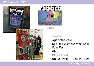
Within this years presentation I talked about the events I had been going to. My favourite was Glug as I got to see many peoples talk and be around a lot of creatives.
What I did in the trip to Berlin such as go to Pentagram.
All of the events and exhibitions I had been to in London. Since I have had many trips to London I tried to see as many design things as I could. I only went to places I was interested in and mainly looked at book related design.
I told the story of my interview and how I was able to listen to Coralie Bickford Smith do a talk and then talk to her in person.
I talked about my interview and how she follows my design account on social media.
Another big part of my year was responsive therefore I talked about some of the competitions I had been doing this year
I talked about how I really enjoyed the penguin brief.
And how I was able to create something I was really happy with for a stationary 
which I had never done before.
I talked about my group work and the skills I had gained
I told about how practicing had made me better at communicating and public speaking. I also talked about how I am trying to put myself out there as a collective.
I also got more of a presence online by getting a behance. I found that I really liked enhance and it was good at being able to see other peoples work.
I finished by talking about what I plan to do within summer and level 5. I discussed that I would be spending the whole summer in California working in a special needs camp where I will be doing photography and memory books. I Also talked about focusing on book making next
 year and trying to brand myself.